On July 10, 2024, the Federal Reserve fined Citigroup $60.6 million and the OCC added $75 million more, a combined $135.6 million, for failing to fix risk data and reporting weaknesses first ordered closed in October 2020. The regulators’ language was blunt: the bank had made insufficient progress on data quality management.
A risk management KPI dashboard is the control that failure points at. One screen carries the 8-12 metrics leadership agreed to watch, each scored against a threshold the board approved, and Citi’s penalty shows what happens when the numbers feeding that screen cannot be trusted.
| Risk Management KPI Dashboard: Key Takeaways |
| The Federal Reserve and OCC fined Citigroup a combined $135.6 million in July 2024 because risk data and reporting gaps from a 2020 consent order were still open. |
| A board-level risk management KPI dashboard carries 8-12 metrics, each tied to a threshold the board risk committee approved before the first refresh. Where the dashboard covers people risk, these HR key risk indicator thresholds show where to set the limits. |
| Only 2 of 31 G-SIBs fully complied with BCBS 239 as of the BIS November 2023 progress report, and the same data disciplines apply to any dashboard build. |
| 59% of organizations still run risk registers in spreadsheets (IIA / Baker Tilly, 2025), so a disciplined Excel build beats an unused GRC module. |
| Pair every KPI with a KRI: performance already delivered on one side, exposure building ahead on the other. |
| An all-green dashboard for two straight quarters is a calibration finding, and the committee should tighten the bands. |
| Refresh cadence follows the risk domain: cyber and liquidity weekly or faster, operational monthly, appetite reviews quarterly. |
The build below stays in Excel because that is where most risk teams already work. The
Internal Audit Foundation and Baker Tilly’s 2025 ERM survey found 59% of organizations still manage risk registers in spreadsheets and documents, and only 21% run a dedicated GRC platform.
What a Risk Management KPI Dashboard Actually Tracks
A quarterly risk report explains; a risk management KPI dashboard monitors. The dashboard carries a small standing set of metrics, refreshed on a fixed cadence and scored red, amber, or green against limits nobody renegotiates mid-quarter. Our library of
ERM dashboard examples shows the format at board level.
The distinction that matters most on the screen is KPI versus KRI. A key performance indicator reports outcomes already delivered, such as audit actions closed on time, while a key risk indicator warns about exposure building ahead. The strongest
key risk indicator examples are leading, not lagging.
KPIs vs KRIs on the Risk Management KPI Dashboard
| Dimension |
KPI on the dashboard |
KRI on the dashboard |
| Direction |
Lagging: reports delivered performance |
Leading: warns of building exposure |
| Example |
% of audit actions closed on time |
% of critical vendors unassessed for 12+ months |
| Owner |
Process or function manager |
Risk owner named in the register |
| Threshold source |
Business plan target |
Risk appetite statement |
| Board question |
Did we deliver the plan? |
Are we drifting outside appetite? |
Both belong on one screen, and the pairing is what the
Institute of Internal Auditors expects under the Three Lines Model. Management owns the performance figures, the risk function owns the early warnings, and directors read them together against the
risk appetite statement examples they approved.
Choosing the 8-12 Metrics for the Risk Management KPI Dashboard
Metric selection is where most dashboards die. Governance research aligned with NACD practice puts the workable board limit at 8-12 metrics, because past that point directors stop reading and weak numbers hide in the volume. Watch days cash on hand and overdue high-risk audit actions first; they move earliest when control health slips.
Every candidate metric passes three tests: a named owner who can move the number, a data feed that refreshes without manual rekeying, and a threshold traceable to the
risk appetite statements by sector the board signed. A metric that fails any test belongs in the
risk register, watched but not displayed.
A Worked Metric Budget for the Risk Management KPI Dashboard
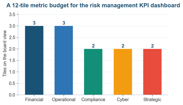 Figure 1. A 12-tile budget spreads coverage across five domains instead of letting one function fill the screen.
| Metric |
Domain |
Cadence |
Threshold anchor |
| Days cash on hand |
Financial |
Weekly |
Liquidity appetite floor |
| Counterparty exposure over limit (%) |
Financial |
Weekly |
Credit limit framework |
| Budget variance on risk remediation |
Financial |
Monthly |
Annual plan |
| Unplanned downtime, critical systems (hrs) |
Operational |
Weekly |
BIA recovery objectives |
| Overdue high-risk audit actions |
Operational |
Monthly |
Audit committee target |
| Turnover in control functions (%) |
Operational |
Monthly |
HR plan |
| Overdue regulatory filings |
Compliance |
Monthly |
Zero-tolerance appetite |
| Regulator findings past due date |
Compliance |
Monthly |
Consent order milestones |
| Systems patched within SLA (%) |
Cyber |
Weekly |
NIST CSF profile target |
| Phishing simulation failure rate (%) |
Cyber |
Monthly |
Awareness program target |
| Strategic initiatives rated red (%) |
Strategic |
Quarterly |
Strategy scorecard |
| Emerging risks added this quarter |
Strategic |
Quarterly |
Horizon scan |
Steal domain metrics from tested libraries instead of inventing them in a workshop. Sector sets for
banks and credit unions,
credit risk, and
liquidity risk already carry thresholds proven in supervision, and they transfer with little edit beyond renaming the owner column.
Setting RAG Thresholds the Risk Management KPI Dashboard Can Defend
Thresholds are governance decisions, and they come before the build. The board risk committee approves green, amber, and red bands for every tile ahead of the first refresh, because a threshold negotiated after a breach is no longer a control. Anchor each band to appetite language directors signed, or to profile targets such as the
NIST Cybersecurity Framework.
| Metric |
Green |
Amber |
Red |
| Days cash on hand |
Above 45 |
30 to 45 |
Below 30 |
| Systems patched within SLA |
Above 95% |
85% to 95% |
Below 85% |
| Overdue high-risk audit actions |
0 |
1 to 2 |
3 or more |
| Critical system downtime (hrs/month) |
Under 2 |
2 to 6 |
Over 6 |
An all-green dashboard is its own warning. When every tile has shown green for two straight quarters, treat that as a calibration finding and tighten the bands, the way
operational risk teams in banking recalibrate limits after quiet periods. A
risk heat map beside the tiles keeps inherent and residual positions visible.
Building the Risk Management KPI Dashboard in Excel
Lay the workbook out in four zones: a data sheet holding one row per metric per period, a threshold table, a status engine, and the display sheet directors see. Nothing on the display sheet is typed by hand; every tile reads from the layers underneath it.
| Zone |
Contents |
Excel feature |
| Data |
One row per metric per period, ISO dates, source system named |
Excel Table, structured references |
| Thresholds |
Green, amber, and red bands per metric, committee-approved |
Named ranges the formulas read |
| Status engine |
Latest value scored against its band, trend direction |
XLOOKUP, conditional formatting |
| Board view |
12 tiles with RAG color, sparkline, and owner |
Linked cells, slicers, sparklines |
Excel Features That Keep the Risk Management KPI Dashboard Honest
Three features carry the integrity load. Excel Tables with structured references stop formula drift when new periods are added, XLOOKUP against named threshold ranges makes every RAG color auditable back to the appetite statement, and sparklines give directors six periods of trend without a second chart sheet.
Protect the sheet, then version it. Lock every cell except the data-entry range, keep a change log tab recording who updated which figure and when, and store the workbook under controlled access. Our
risk assessment matrix template and
risk register template follow the same discipline.
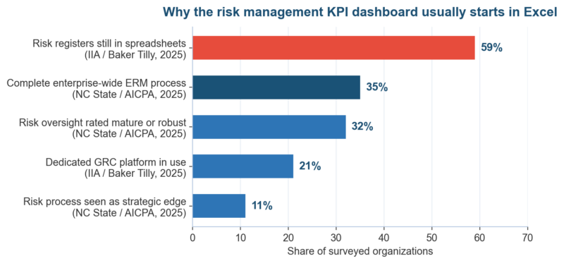 Figure 2. Survey numbers from NC State, the AICPA, the IIA, and Baker Tilly explain why the board view usually starts life in a workbook.
The survey gap is the opportunity. With 59% of programs already in spreadsheets, the fastest maturity gain is rarely new software; it is imposing dashboard discipline, thresholds, reconciliation, and a named refresh owner, on the workbook the team already trusts.
The
NC State and AICPA 2025 State of Risk Oversight found just
35% of organizations with complete ERM processes.
Data Quality Rules the Risk Management KPI Dashboard Inherits From BCBS 239
Citigroup’s July 2024 penalty was a data quality failure at reporting scale. The Federal Reserve’s order cited
insufficient progress on data quality management and missing compensating controls, four years after the OCC’s October 2020 consent order demanded an enterprise-wide data governance program, as Citi’s own
SEC filing records. Displays inherit the defects of their sources.
BCBS 239, the Basel Committee’s
risk data aggregation principles, remains the reference standard even outside banking. The
BIS progress report of November 2023 found just 2 of 31 global systemically important banks fully compliant with all 14 principles, a decade after the text was published.
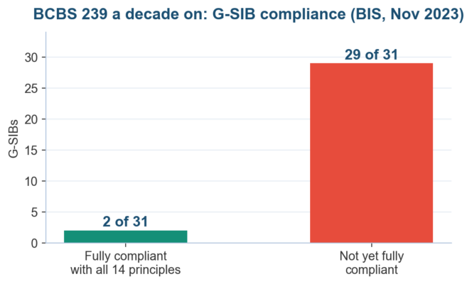 Figure 3. BIS progress reporting shows how slowly risk data aggregation discipline lands, which is exactly why a dashboard build starts with its data layer.
| BCBS 239 principle |
What it demands |
Dashboard rule |
| P3 Accuracy and integrity |
Data reconciled to source systems |
Tie each tile to a system extract, never a rekeyed figure |
| P5 Timeliness |
Data available when risk decisions need it |
Refresh cadence matched to the risk domain |
| P7 Report accuracy |
Reports reconciled and validated |
Monthly reconciliation sign-off on the change log tab |
| P9 Clarity |
Reports easy to understand |
One screen, 8-12 tiles, plain-language metric names |
| P11 Distribution |
Right people, right time |
Pack circulated seven days before the committee meets |
Supervisors keep tightening. The European Central Bank carried risk data aggregation remediation into its 2025-2027 supervisory priorities with explicit escalation warnings, and
EY’s 2025 briefing on the program calls full compliance a baseline supervisory expectation.
Non-banks reading along should treat the principles as free consulting, as
Compliance Week’s coverage of the Citi orders makes plain.
Who Owns the Risk Management KPI Dashboard
A dashboard without a named owner rots inside a quarter. The chief risk officer curates the metric set and defends threshold changes, a designated analyst runs the refresh, internal audit samples the figures annually, and the board risk committee owns the decisions the colors trigger.
| Role |
Duty on the dashboard |
Cadence |
| Board risk committee |
Approve metrics and thresholds, act on every red tile |
Quarterly |
| Chief risk officer |
Curate the metric set, defend threshold changes |
Monthly |
| Metric owners |
Explain movement, deliver remediation dates |
Monthly |
| Dashboard analyst |
Refresh data, run reconciliation, log changes |
Weekly |
| Internal audit |
Sample tiles back to source systems |
Annual |
Write the escalation rule down. A red tile triggers a one-page exception note from the metric owner within five working days covering cause, exposure, and the date the number returns to amber. Our
internal audit KRI guide and
risk reporting guide show the supporting pack.
Circulation timing matters as much as content. Board Intelligence and NACD-aligned guidance puts the floor at seven days before the committee meets, so directors arrive having read the pack.
COSO’s ERM framework treats that information flow as a governance component, and our
COSO ERM components post maps it.
Frequently Asked Questions About the Risk Management KPI Dashboard
How many metrics should a risk management KPI dashboard include?
Hold the board view to 8-12 metrics. Beyond that, reading discipline collapses and weak numbers hide in volume, which defeats the screen’s purpose. Function-level views can carry more; the
key risk indicators dashboard examples post shows tiered layouts that keep the board tier small.
What is the difference between a KPI and a KRI on a risk management KPI dashboard?
A KPI reports performance already delivered, such as audit actions closed on time, while a KRI signals exposure building ahead, such as critical vendors overdue for reassessment. Pair them on one screen so delivered results sit next to forward warnings. The
KPIs for risk management list carries 20 performance-side candidates.
Can a risk management KPI dashboard be built in Excel instead of GRC software?
Yes, and most are: 59% of organizations still run risk registers in spreadsheets per the IIA and Baker Tilly’s 2025 survey. Excel works when the workbook enforces one data sheet, named thresholds, locked cells, and a change log. Volume, workflow, and audit-trail demands are the signals to graduate.
How often should a risk management KPI dashboard be refreshed?
Match cadence to the domain. Cyber and liquidity indicators move weekly or faster, operational metrics settle at weekly or monthly, and appetite-level reviews run monthly or quarterly. Whatever the rhythm, circulate the board pack seven days before the meeting so the colors get read, questioned, and acted on.
Who should own the risk management KPI dashboard?
Give it three named owners with different jobs. The chief risk officer owns the metric set and threshold proposals, a dashboard analyst owns the weekly refresh and reconciliation log, and the board risk committee owns the bands plus every decision a red tile triggers. Internal audit samples annually.
What thresholds should a risk management KPI dashboard use?
Use RAG bands anchored to the risk appetite statement, approved by the committee before go-live. Set green as comfortably inside appetite, amber as the discussion trigger, and red as the escalation trigger with a written exception process. Recalibrate after two consecutive all-green quarters; the
supply chain KRI set shows worked bands.
Risk Management KPI Dashboard Pitfalls and Remedies
Most failed dashboards die from the same short list of causes. The table pairs each with its root cause and the remedy that has worked in practice, and every remedy traces back to a section above, which is the point of building the KPI dashboard as a system.
| Pitfall |
Root cause |
Remedy |
| Metric sprawl past 20 tiles |
Every function demands a slot |
Cap the board view at 12; push the rest to function views |
| All-green quarters |
Thresholds set to flatter |
Committee recalibration after two consecutive green quarters |
| Hand-keyed figures |
No system extract behind the tile |
One data sheet, reconciliation log, annual audit sampling |
| Owners set their own thresholds |
Governance gap at go-live |
Committee approves every band before the first refresh |
| Pack shipped, never read |
No agenda slot, late circulation |
Fixed agenda item, circulated seven days ahead |
| KRI-free screens |
Performance bias in selection |
Pair every KPI with a leading KRI |
| Stale after one quarter |
No named refresh owner |
Weekly analyst duty backed by the change log |
Looking Ahead: The Risk Management KPI Dashboard Through 2027
Expect supervisors to keep raising the price of weak risk data. The ECB has written escalation into its 2025-2027 priorities, and US regulators showed with Citigroup that consent order patience runs out in public, with nine-figure penalties attached. Dashboard data lineage is now a survival trait.
By 2027, anomaly detection will likely sit inside the workbook itself. Spreadsheet platforms are shipping AI assistants that flag outlier movements and draft variance commentary, which shifts the analyst’s job from producing the pack toward challenging it. The threshold logic still has to come from the committee.
Convergence is the other line to watch. Boards increasingly ask for one integrated view where strategy scorecards and risk tiles share definitions, the direction both
ISO 31000 and COSO ERM have pushed for years; our
ISO 31000 versus COSO comparison explains where the two frameworks meet. Performance and risk reporting are merging into one conversation.
Start with twelve tiles this quarter. A working risk management KPI dashboard built in a locked workbook, reconciled monthly and read seven days before each committee meeting, beats a two-year platform program that never ships its first board pack. The discipline transfers when the platform eventually arrives.
Infographic: The Risk Management KPI Dashboard by the Numbers
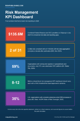 Figure 4. Five numbers frame board risk reporting in 2026, from Citigroup’s $135.6 million penalty to the 8-12 tile budget.
Build Your Risk Management KPI Dashboard With Risk Publishing
We help US mid-market chief risk officers stand up a board-ready risk management KPI dashboard in four working sessions, from metric selection through threshold approval. Explore our
advisory services, then
contact us with your current risk register; the first session maps it onto twelve defensible tiles.
Get the ERM Risk Register Template (Excel)
Put this guide into practice without building from scratch: a ready-to-use Excel risk register with a live dashboard, 5×5 inherent and residual heatmaps, automatic risk appetite testing, and a KRI tracker. Aligned to ISO 31000:2018 and COSO ERM, with 12 worked sample risks included.
Buy the Risk Register Template – $29
Chris Ekai is a Risk Management expert with over 10 years of experience in the field. He has a Master’s(MSc) degree in Risk Management from University of Portsmouth and is a CPA and Finance professional. He currently works as a Content Manager at Risk Publishing, writing about Enterprise Risk Management, Business Continuity Management and Project Management.