
The key indicators of country risk and economic health are GDP growth, inflation, unemployment, interest rates, government debt, the balance of payments, currency stability, sovereign credit ratings, institutional quality, and social measures like education and inequality. Analysts group them into economic, fiscal, political, and social pillars, then score each against peers and trend.
On May 16, 2025, Moody’s stripped the United States of the Aaa rating it had held since 1917, cutting it to Aa1 and projecting federal debt at 134 percent of GDP by 2035. The last of the three major agencies had folded; no AAA remained.
The world’s benchmark borrower now carries the same downgrade arc as any emerging market: S&P moved in 2011, Fitch in August 2023, Moody’s in 2025, each citing deficits, interest burdens, and political gridlock. Country risk analysis stopped being a developing-world specialty somewhere along that line.
We read sovereign data for a living, and the working method is neither mysterious nor agency-exclusive. Ten indicators, four pillars, a scoring discipline, and a refresh cadence will tell you more about a country’s direction than any headline, and the toolkit fits on one page.
What Country Risk Indicators Actually Measure
Start with what the term covers. Country risk is the chance that political, economic, or financial conditions in a nation impair the value of investments, contracts, or operations exposed to it, and country risk indicators are the measurable signals that move before that impairment lands. They answer a risk assessment question at national scale.
Two families of exposure sit under one label. Macro country risk hits every firm in the jurisdiction at once, through devaluation, capital controls, or default, while micro risk targets specific sectors or foreign operators, the way expropriation or licensing reversals do. The monthly geopolitical risk report template separates the two in its structure.
| Pillar | What it captures | Leading signals |
| Economic | Growth, prices, labor markets | GDP trend, inflation, unemployment |
| Fiscal and external | Government finances and trade position | Debt-to-GDP, deficit, current account, reserves |
| Political and institutional | Stability, rule of law, corruption | Governance scores, election calendar, sanctions exposure |
| Social | Cohesion and human capital | Inequality, education, health measures |
The pillars discipline the reading. A country can post strong growth while its institutions decay, which is why single-number verdicts mislead and why the IMF’s World Economic Outlook tables and governance data get read together in any serious review. Our key risk indicators directory applies the same pairing logic inside companies.
Figure 1. Four pillars, ten core indicators: divergence between pillars is itself a warning signal.
Why Sovereign Risk Is Repricing Right Now
The pillars matter more now because the baseline is moving. Developing countries paid a record $1.4 trillion to service external debt in 2023, the World Bank reports, with interest costs jumping 33 percent to $406 billion, the highest in two decades.
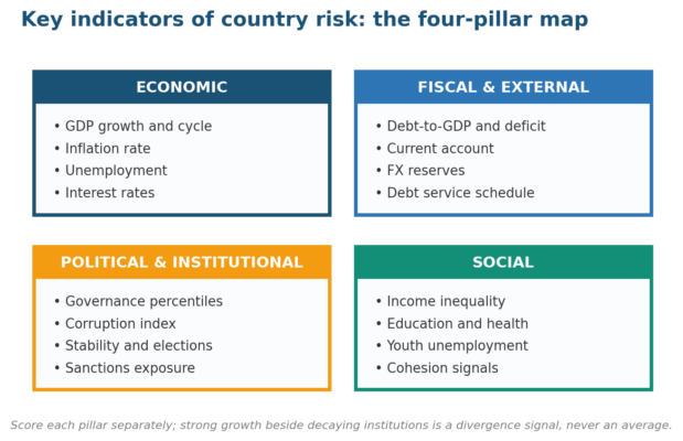
Figure 2. The 2023 debt-service bill: interest alone reached $406 billion, a 20-year high.
The squeeze is not evenly distributed. The countries eligible for the World Bank’s IDA window paid a record $96.2 billion in debt service, and total external debt of low- and middle-income countries reached $8.8 trillion; budgets for health and education absorb the difference.
Wealthy sovereigns are repricing too, and the US arc is the proof: US federal debt passed $36 trillion while interest outlays climbed toward the top of the federal budget. When the benchmark risk-free asset carries a downgrade history, every country risk model that anchors on it needs rebasing.
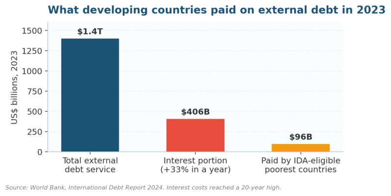
Figure 3. Three agencies, one direction: the US downgrade sequence from 2011 to May 2025.
The Ten Country Risk Indicators That Matter Most
Against that backdrop, here is the core set. Each indicator earns inclusion by being public, comparable across countries, and predictive enough to move before losses do; sources are the BEA and BLS for US data, with IMF and World Bank series for everywhere else.
| Indicator | What it signals | Red-flag reading |
| GDP growth | Output direction and cycle position | Two consecutive contracting quarters |
| Inflation rate | Price stability and policy credibility | Double digits, or entrenched deflation |
| Unemployment | Labor slack and social pressure | Youth unemployment above 25% |
| Interest rates | Policy stance and funding cost | Real rates deeply negative, or spiking |
| Government debt-to-GDP | Fiscal headroom | Above 90% and rising without a plan |
| Trade and current account | External funding need | Persistent deficit above 5% of GDP |
| Currency and reserves | Buffer against external shocks | Reserves under three months of imports |
| Sovereign rating and spreads | Market-priced default odds | Cut to junk; spreads over 700 bps |
| Institutional quality | Rule of law, control of corruption | Falling governance percentile ranks |
| Social indicators | Cohesion and human capital | Rising inequality plus falling school completion |
Read levels and trajectories together, because a stable bad number beats a deteriorating good one. Argentina’s inflation and Japan’s debt ratio both exceed textbook limits with opposite market treatment, which is the argument for trend-scoring every line in the table above rather than grading snapshots. Trend beats level, and a peer group of neighboring economies beats both used alone.
Free, primary sources cover the entire table, so a paid terminal stays optional until portfolio size genuinely justifies the spend. Pull each series from the publisher itself, and note each release lag in your monitoring calendar before you build anything:
- IMF World Economic Outlook databases for growth, inflation, and fiscal series across 190 economies
- BEA national accounts and BLS labor data for the US baseline
- World Bank debt statistics for external debt stocks and service schedules
- Worldwide Governance Indicators for institutional-quality percentiles since 1996
- Transparency International’s CPI for corruption trend lines across 180 countries
- UNDP Human Development Index for the social pillar
From Data to Decision: Scoring a Nation’s Exposure
Indicators become useful when they compress into a decision. Professional scorers weight the pillars, and their outputs are public enough to benchmark against: the OECD’s country risk classifications band 0 to 7 drive export credit pricing, and agency ratings translate the same data into default probabilities.
| Tool | Publisher | What it gives you |
| Country risk classifications (0-7) | OECD | Export credit premium bands, updated through the year |
| Sovereign ratings and outlooks | Moody’s, S&P, Fitch | Letter-grade default risk with watch signals |
| Country risk premiums | Damodaran, NYU Stern | Equity premium add-ons by country, refreshed each January |
| Market classification | MSCI | Developed, emerging, frontier, and standalone buckets |
| Governance percentiles | World Bank WGI | Six institutional dimensions since 1996 |
| Corruption Perceptions Index | Transparency International | 180-country corruption ranking, annual |
Two tools in the older literature no longer exist, which matters if you inherited a checklist. BlackRock’s Sovereign Risk Index stopped publishing, and Institutional Investor’s country credit survey is likewise defunct; replace both with the Damodaran country risk premium tables, updated every January and free.
Market classification matters for flows: MSCI’s annual review moves countries between emerging and frontier buckets, and index-tracking capital moves with it. Pair that with governance percentiles and the corruption index so the political pillar carries numbers in your final memo.
The rating scale itself is the quickest translation layer. Investment grade ends at Baa3/BBB-, and the distance a sovereign sits from that line, plus its direction of travel, tells you more than the letter alone; the US at Aa1 remains high-grade, but the trajectory is the story, a pattern scenario-based assessment is built to explore.
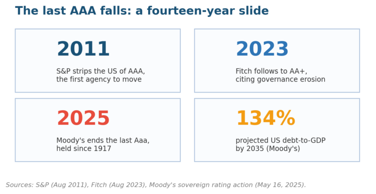
Figure 4. The rating ladder: distance from the Baa3/BBB- floor plus direction of travel carries the signal.
A Monitoring Dashboard You Can Defend
Scoring is a snapshot; exposure is continuous. We run country dashboards the way we run any risk management KPI dashboard: a short indicator list per country, thresholds set in advance, a named owner, and a review rhythm matching how fast each series updates, with BIS statistics covering the banking-exposure rows.
| Dashboard row | Threshold example | Response when breached |
| Sovereign spread vs US Treasuries | 200 bps widening in a quarter | Reprice the country premium; review exposure caps |
| Currency vs 12-month average | 15% depreciation | Test hedges; re-run contract economics |
| Reserves in import cover | Below 3 months | Flag transfer and convertibility risk |
| Rating outlook | Any negative watch | Pre-position exit or insurance options |
| Governance percentile | 10-point drop | Escalate to the risk committee |
| Election or transition window | Within 6 months | Freeze new commitments pending review |
Thresholds convert news into procedure. The response column is written before any breach, budgeted like every other treatment in how you manage risk, and owned by someone who can actually execute it; that is what turns an alert into action.
Operators need the same dashboard as investors, with different rows. Concentration of suppliers in one jurisdiction is a country bet whether you meant it or not, which is why supply chain risk reviews and third-party concentration checks belong beside the financial indicators, feeding the same escalation paths, sanctions screening included.
Common Questions About Country Risk Indicators
The questions below arrive whenever we present a country dashboard to a board or an investment committee. Answers front-load the practical decision; the linked guides carry the full method where one exists, and the sources above cover the data behind every number quoted here.
What are the most important country risk indicators for investors?
Start with five: sovereign spreads, debt-to-GDP with its trend, inflation, reserves in months of import cover, and governance percentile direction. Those move earliest and are hardest to manipulate. Add sector-specific lines once the base five are trending in a dashboard you actually review, then extend using our best KRIs shortlist.
How is a country risk premium calculated?
The common method starts with a sovereign default spread, from ratings or credit default swaps, then scales it by the equity-to-bond volatility ratio to price equity exposure. Damodaran publishes the resulting premiums for every rated country each January, which makes his tables the standard free benchmark.
Which agencies publish country risk ratings?
Moody’s, S&P Global, and Fitch dominate sovereign letter ratings, while the OECD maintains export credit classifications and MSCI assigns market-status buckets. Read at least two side by side; splits between agencies, like the US carrying Aa1 and AA+ simultaneously, are themselves information about uncertainty.
How often should country risk assessments be refreshed?
Quarterly for stable exposures, monthly where you hold concentrated positions, and immediately on trigger events: a downgrade, a disputed election, capital controls, or a currency break. The cadence logic mirrors how often any risk assessment runs: the faster the underlying conditions move, the shorter the review cycle gets.
What is the difference between country risk and political risk?
Political risk is one pillar inside country risk. Country risk totals everything that can impair value in a jurisdiction, spanning economic, fiscal, political, and social drivers, while political risk isolates government action: expropriation, capital controls, sanctions, instability. The distinction matters because assessment and management tools differ by pillar.
Can a small business use country risk indicators without a research team?
Yes: every source in the table above is free, and five indicators tracked quarterly cover most small-firm exposures. The KRI development method scales down; pick indicators tied to your actual exposure, set two thresholds each, and write the response before you need it.
Red Flags to Watch (And Green Lights to Chase)
Country analysis fails in recognizable ways, and most failures are self-inflicted process errors. The table splits the warning signs we flag in client reviews from the practices that reliably improve calls; treat the left column as an audit checklist for your current process.
| Red flag | Why it costs you | Green light to build instead |
| Single-source scoring | One index hides pillar divergence | Two independent sources per pillar |
| Snapshot bias | Levels without trends miss turning points | Twelve-quarter trend lines on every indicator |
| Home-country anchoring | US baselines misprice frontier exposure | Peer-group comparisons within regions |
| Stale tool lists | Defunct indexes inherited from old checklists | Annual source audit; retire dead series |
| Event chasing | Reacting to headlines after markets moved | Pre-set thresholds and standing responses |
| Ignoring the social pillar | Cohesion breaks surprise pure economists | Inequality and education lines on the dashboard |
The stale-tool row is the quiet one that embarrasses professionals, because defunct indexes keep circulating in inherited checklists for years. Audit sources annually, date-stamp every series, and retire anything that stopped publishing; an operational risk review applies the identical discipline to internal feeds.
What’s Coming Next: 2026-2028
Sovereign risk will stay repriced upward through this window. The IMF’s latest projections keep global growth around 3 percent, modest by pre-2020 standards, while debt service climbs, and no major agency has the US on positive outlook; the direction of travel is set.
Expect the indicator set itself to widen. Climate exposure is entering sovereign methodologies, cyber and infrastructure resilience are following, and governance data grows more granular each cycle; the four-pillar frame absorbs the newcomers without redesign, which is why pillar-anchored dashboards age better than product-anchored ones.
Watch the benchmark question hardest. If US fiscal trends hold Moody’s course toward 134 percent debt-to-GDP, every model that treats Treasuries as the riskless anchor drifts quietly wrong, and country risk premiums calculated off that anchor drift with it. Rebasing those assumptions is the 2026-2028 task, and early movers reprice first.
Bring us the countries on your exposure map and we will pressure-test the indicator set behind each one. The engagement options sit under our services, and the fastest start is a note through the contact page listing the three jurisdictions that worry you most.

Chris Ekai is a Risk Management expert with over 10 years of experience in the field. He has a Master’s(MSc) degree in Risk Management from University of Portsmouth and is a CPA and Finance professional. He currently works as a Content Manager at Risk Publishing, writing about Enterprise Risk Management, Business Continuity Management and Project Management.